UX Design certification final project
ODIE
2019 was a year of many things, and gaining UX Certification was on the list. I enrolled at Brainstation with instructor Dallas Kwok and created a concept idea for a mobile app.
ODIE Concept Company
I came up with ODIE, a marketplace app that lets businesses showcase their services. Users can search by business name, service type, location, ratings, and price. ODIE addresses the challenge of booking services by replicating the ease and convenience of food delivery apps.
Competitor Analysis
I always start by examining the existing options available for users to accomplish similar tasks.
By analyzing various service providers, I went through each user flow, selecting a few services in my area to fully understand the user experience.
Key Findings
Users must create a new login every time they want to see available services.
If the first choice does not have availability, users must view (and create a new login) with another service provider, which is highly frustrating.
User Research and Personas
My research identified three main personas common in urban environments: busy millennials and later Gen-X individuals who prioritize convenient locations (transit/walkable) and service availability.
Information Architecture
The app features five main screens: Home, Browse, Schedule, Saved, and Account. Users can search and book services through the Browse & Search screen, access saved or favorited options, or start from the main Home screen.
User Flows
Let’s simplify the process: book the user’s appointment, ensure they reach it smoothly, and make cancellations and rebooking easy. Here are the main happy flows:
Find a Service
Enable users to search for or browse specific services easily.Easy Booking Process
Minimize friction points to ensure a smooth booking experience.Notifications & Instructions
Ensure users receive notifications for upcoming appointments and clear instructions on how to reach their destination.Cancellations & Rebooking
Provide a straightforward process for canceling or rescheduling appointments, accommodating users' changing needs.Simplicity
Keep the app focused and free of distractions or features that do not directly support the needs and goals of the personas.
Sketching & Wireframe Prototyping
Sketching is an effective way to rapidly get ideas down without getting bogged down by UI details. It allowed me to quickly identify key areas to focus on and pinpoint features that could be easily eliminated.
View rapid prototype (Marvel) shown to user testers during the first phase of user testing
Color
The primary color, #4201FF, is vibrant and eye-catching while meeting web accessibility standards (WCAG AAA: Pass against white) and color blindness criteria.
Additionally, with the rise of new smartphones featuring stunning OLED displays with true black, I took advantage of this by using #000000 for a striking visual effect.
Typography
Lower x-height fonts are stylish and trendy but can be harder to read. I chose Poppins as my main display font, which has a slightly lower x-height but maintains excellent readability.
Roboto, developed by Google, is a highly accessible font with a slightly taller x-height. It complements Poppins well and allows more characters to fit on the same line.
Iconography
Some icons were taken from Google Material Icons, although some were not available so I created those with Google Material standards.
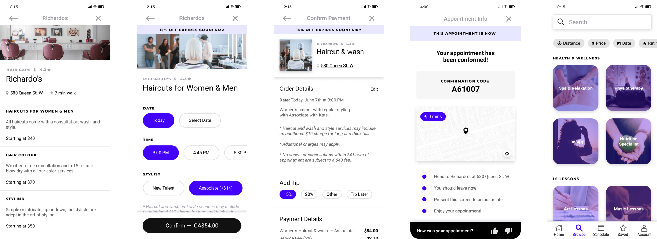
High Fidelity Prototype
After establishing all UI design elements, applying those to the wireframes was the natural next step. There are also realistic interactions built in this process to help test usability.


