Food2Desk
Branding and Visual Design
Food2Desk came to me with the idea for an app that caters to social distancing during peak covid and required assistance getting their company off the ground. Starting with branding, then leading to the app design, and finishing with bold marketing assets.
Branding
The focus for the brand was to be bold, no-nonsense, and approachable. With the bold orange color that stood out from its environment and the easy to read text that helped get the message across created an easy to understand and approachable app that gained popularity (at the time) quite rapidly.
Information Architecture
The app features five main screens: Home, Browse, Schedule, Saved, and Account. Users can search and book services through the Browse & Search screen, access saved or favorited options, or start from the Home screen.
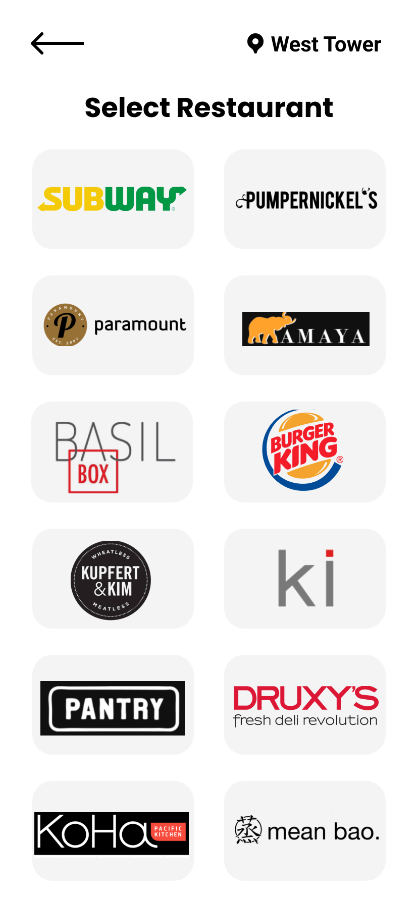
High Fidelity Prototype
Due to time and budget constraints, stakeholders skipped wireframing and moved directly to high-fidelity mockups once the user flows were approved. The pandemic's surge in demand for contactless food delivery accelerated this process.
We weren't reinventing the wheel, and the final design had few issues.


Marketing
While working with Food2Desk, I also had the privilege to work on customer acquisition (aka: ToFu content) to help bring new customers to the new app. This included branding and promotional materials to help the overall buyer journey. I helped create (even wrote!) the promo ads that would be displayed within the office towers of Toronto’s financial district.


